Tuesday, 15 October 2013

Limited palette study

For this limited palette drawing I used the two colours of black and red plus the white of the paper. The sense of depth is helped by the linear perspective of the buildings as they recede together with the narrowing of the pavement. The colour/aerial perspective was helped by using stronger colour on the nearest roof which fades out as it gets further away.
 
This view is of buildings in Kelvedon which I chose because I liked the shapes of the roofs. I went on Sunday as I still find it difficult to work when lots of people are around but I know this difficulty will diminish as I become more confident. However being a Sunday might make the atmosphere a little quiet but not as quiet as this seems in the sketch.  I found the preliminary sketch sufficiently useful. Also I took several photographs for home reference. However I believe the colour is fairly accurate as these are old hand made tiles and the houses have black wooden beams so fairly straightforward to depict. If I was doing this again I would like to capture more in the way of street furniture such as lampposts and signs as well as people.

Log p93 Trees


This large flowering cherry is situated in my garden at home. It is very old and quite magnificent but also has a delicate foliage and graceful habit. I set up the easel in the garden after making several sketches and tired to capture its elegance. Also this tree has a really large trunk and the typical cherry features of shiny bands round about the trunk although being so old these are more gnarled than they once were. I tried to bring the tree forward by heavy shading behind one side and tried to indicate its depth and roundness by adding darker tone to the right hand side. Definitely missing though I think is any sense of scale-the trunk does show some of this but an object or person would help to give the tree its proper majesty. I also found it hard to be near enough to see detail but at the same time being far enough away to get size. This is where the preliminary sketches come in but still I found it difficult with such a large tree.

I sketched several trees including conifer and palm trees whilst on holiday. In each case I tried to see what was distinctive about the shape of the overall tree and the way the branches hung as well as the type of foliage. What I find most difficult is getting the simplified and overall tone on the tree. Squinting does help to isolate the larger shapes but these still need to be simplified to save lots of little tonal areas that are messy.

Reading Doreen Roberts book 'Drawing Workshop' I saw that she asked her tutor once how to draw trees. She said his reply was 'well, this week I'm doing it like this... last week I did it like this... and next week I might do it like this...' following each with a quick scribble. She says she realised he was saying find out for yourself and this advice she passes on to her readers. So lots more practice required.

In drawing this clump of trees I was looking for an area that would show a large foreground tree together with some smaller trees further back. This view also conveniently provided a small path going into the wood. I wanted to show that some trees were dark against their background and that some were light against their background as well as the fading colour of the trees further back. Most of the trees were very upright and I felt it needed some horizontals to alleviate this which I added at home. However, I felt quite nervous being in the wood alone with many strange noises and this didn't help concentration. Next time I'll take a friend along with me.

Final Assignment

View from a Window.

The purpose of this assignment, I decided, was to do with what we had learned about perspective and light as the unit has concentrated on these through research and studies. Consequently I looked for a view through my windows that gave opportunity to show depth and linear perspective. Moreover, I considered that the contrast of light between outside and inside would be important and eventually chose the view from my bathroom window.


This view looks out over our extension roof and beyond to the field and trees. I attempted to create the correct perspective of the roof and faded out the colour as it got further away. The trees were done in brighter greens at the front and the conifer was done in blue greens. The field was faded out similarly to create depth. When doing this I wondered what to include around the view and looked at paintings on the internet. I noticed that some of these stopped at the window frame but thought that by including  walls around the frame would give an extra dimension of depth as well as more contrast between the light coming in and the darker walls inside. I knew too that I was worried how to shade the walls and the best way of doing it. I used watercolour pencils in order to be able to  create a wash but the final result is far too overworked and probably a lighter colour would have been better. Also I think the foreground is overworked as I laid down more and more colour in order to get more contrast of tone.
Finally I felt that there was a lack of a focal point and so went over the trees on the horizon in darker colour. In doing this I also felt that there was a better balance between both sides of the picture. Having executed some sketches for this when the sun was shining the day I had to concentrate on this was overcast thus changing the tones completely as there was no shadows around.
 
Whilst this composition is not very exciting I think I did somewhat succeed in achieving a sense of depth and a sense of light coming through the window. It's also the most complicated drawing I've done so far and so although not a great success in many ways I think I've learned a lot in this unit and have made progress.


Wednesday, 9 October 2013

Log- p76 Simplify and select

Simplify and select

Using a viewfinder undoubtedly helps in selecting a study when there is so much landscape to choose from before your eyes. However whilst country landscapes often present the ideal composition of foreground, middle ground and background I still found concentrating on simple shapes could be difficult. I live in a lovely area of countryside, not too far from Constable country, and feel that I could stop almost anywhere and find a lovely view. Historic buildings, riverbanks, lots of trees and fields with hedgerows are all within a stone's throw. Also, the skies around me are large and often beautiful in their colour and shapes as shown in many paintings by John Constable.

Cloud shapes constantly change and so a degree of memory is useful to sketch them. The perspective means that they get smaller as they get further away but sometimes it seemed hard to observe this if they were moving particularly quickly. I read that clouds should look as though they are in front of the sky so the tone of the sky should still come through.  Also lots of tiny clouds can end up looking a mess so it's probably best to keep things simple especially if the foreground/middle ground is busy.

To create a sense of distance in the sketches I used more detail in the foreground, gradually made things smaller as they got further away and varied the tone. I made some notes on light direction such as the side of a house being in shade whilst the front was brighter and tried to put tonal differences in trees although not successfully.

Helpful additional preliminary work would have been more detailed sketches and coloured sketches as often I found myself walking back to the site of my sketch for further information more than once.
 
I decided to choose this scene for my larger A3 study. The reason I chose this is because this unit of work deals with perspective of various kinds and I thought the style would add linear perspective whilst the field added the aerial perspective. I wanted to make the tree on the horizon the focal point and wondered whether I could make the vanishing point of the style as well as the public footpath sign meet there at the tree. The foreground was more detailed and I tried to use warmer colours than in the background. When I was putting the colour onto the field for aerial perspective I was doubtful of my ability to do it correctly. This was because I knew that the more difference in colour the further the horizon would look. I hoped I did it properly so that the tree is in scale. It was only after completing this drawing that I realised the brief was to include a middle ground. The foliage behind the sign acts as a kind of middle ground I hope and in reality this should have been light against dark but I was unsure how to achieve this with coloured pencils and such small stalks. In reality the scene was much more drab in keeping with a miserable day so the zingy colours in this are not at all in keeping but again I'm not sure yet how to create contrast in the foreground greens without using bright colours. I have read several books on colour theory but need a lot more practice.

Wednesday, 3 October 2012

Final composition Part 2

Final composition - part 2


I struggled with this final piece of work and for a number of reasons. Initially, this was set up on the window sill. The windowsill is 'white' and so is the jug containing the flowers. With the light of the glass behind, the whole composition would be very high key if I left the colour as it was, which I considered doing in shades of grey with a contrasting strong colour for the flowers. However as this is an exercise in colour I decided that this would be unsatisfactory and so started thinking about colour schemes.

I had decided upon colour pencil as detail was required and tried this on smooth Fabriano paper. However, the coloured pencils I use are Faber which are oil based and harder than other wax based pencils. Consequently, when I tried to depict the glass with large hatching strokes the whole thing looked too busy and was competing with the flowers.

Because of this I tried a quick sketch in different coloured inks with pen but found it too insipid so went back to my first choice of medium but decided to include watercolour pencils for the larger background areas and for some detail on the petals in order to try to gain a looser, transparent look. Consequently I used a watercolour paper to take the washes.

Before moving to my final choice as above and to overcome the lack of 'colour' I thought it would be interesting to try the drawing on grey pastel paper but this made the whole thing look too heavy. So as well as deciding on the coloured pencils I decided too that white paper would be best.

The next concern was the colour palette. I wanted to limit the colours but stay with the local colour of the flowers. As the flowers were drawn in a blue red I thought the tone on the window frame could be done in blue in order to keep a harmony. The jug was done in shades of brown for warmth and contrast and complements the blue as does the wall colour of a slightly lighter shade of brown. I was hoping that the colour of the jug would bring it forward but not detract from the focal point of the flowers. The background glass is done in a very weak blue wash over which I tried to hatch white colour pencil to create an effect of glazing. This was unsuccessful.
I'm not sure if the back of the window frame is correct?
Although aerial colour perspective suggests that colour should fade as subjects move away this part of the window was in the deepest shade. I've looked at this part of the work often but cannot decide whether or not the colour is too strong here.
For some reason I had it in mind that the object for this assignment was a vase of flowers and I became keen to portray the lilies. However having done much of the work I realised that other objects were meant to be part of the composition. And that the other objects should be 'found' as were used earlier. Considering this omission and how to rectify it was difficult as I thought the picture could look too cluttered. Also, because the lilies are fairly exotic looking I thought that English countryside items would look out of place- I did put one other object on the shelf and left it at that.  

I hope that the perspective as well as the colour gives an impression of depth. The vanishing point was off the paper and I tried to work it out correctly which I thought important as I knew that buildings were coming up in the next part of the course.

Overall, I believe my work has improved during the course of this unit and I have learned a lot about colour theory and different media. 

Tuesday, 2 October 2012

Animals- Leonardo, Durer.

 
 Durer


It's hard not to like this splendid specimen which Durer drew without having seen a rhinoceros but from a description given to him at third hand. What it shows is Durer's close attention to the detail of his drawing which is similarly evident in this famous drawing of a hare.

 
This drawing reveals Durer's reported interest in science and was completed in 1502. The fur detail was painted over a colour wash to give an impression of fur and underlying structure. Apparently, Durer usually worked in three stages. First brushing in outlines, then colored areas finishing with the more detailed work.


This 'Wing of a blue roller' was completed in 1512. It is watercolour and opaque on parchment. Wing joints are rendered anatomically correctly and it's thought that he may have used this study for modelling angels' wings.
 
 
Finally I've included this almost walrus drawing; a 'Head of a Walrus' in ink and brown Indian ink. Durer is quoted as saying 'the more accurately your work represents life, the better it will appear...' Durer's love of detail is shown in this drawing which appeals to me in different ways. At times I find the expression almost fearful and at others almost comical. This drawing together with several others is held in the 'British Museum' though I suspect not on display as they are probably too light sensitive.
 
 
Leonardo was a scientist as well as an artist and his drawings of animals show this interest in the same way as do his studies of human form.
 

This drawing of a horse is one of many studies made but his interest was all embracing and he drew dogs, cats lions and grotesque animals.


The study of horses is indicative of Leonardo's ability to convey movement whilst the lower image of a page from his sketchbook captures characteristic poses.

Tight rigorous work/Expressive styles of artists' work

Ingres- Toulouse Lautrec

In the 19th century divergent views of art were leading to different styles. The academies continued to teach drawing in a traditional way which was supported by Ingres amongst others. However there was a growing number of artists such as Courbet who thought that the schools were superfluous. By the end of the 19th century fresh ideas were developing as the modern era of photography and psychology brought  new styles into the world of art. The Bauhaus was opened in 1919 in Germany which united art with design. The revolution in materials helped create new works and mark making became sufficient in itself as a reason for a work. In Vienna, Schiele, amongst others, was thrown out of the Academy for demanding reforms in teaching. 

As Ingres supported the classical methods he could be said to follow a disciplined classical style or neo-classical style. This style is one that carries the idea that 'art imitates life'. The ateliers taught drawing by asking students to draw plaster casts of figures or sculptures until they reached a point when their skill was refined which entitled them to enter the life room.  

However, there is no doubt when looking at Ingres' portraits, and there are over 400 extant, that we feel that we are looking at a true likeness of the sitter.

 
This portrait by Ingres of Alfred Emilien typifies his work in that it draws our interest to the subject's face. It is darker and drawn with finer detail than the rest of the figure which seems more loosely drawn, with hatching strokes clearly visible, and has  less tonal variation. However, the clothing serves to reveal the underlying form of the subject. The curve of the cuff and the tightness of the jacket, showing the material's creases, reveal to us the shape of the man's body. Apart from the precise features another typical characteristic of Ingres' work is in the firm outlines, quite clear in the lapel of the jacket.

This  drawing which I was fortunate enough to see this year at the Fitzwilliam Museum in Cambridge is in many ways similar in style to the one above.  I was surprised when I saw it at how delicate it seemed in its execution. Ingres enjoyed using graphite on wove paper and often squared up his images for final execution. The detail of buttons on the right hand jacket is remarkable in its detail.

As these drawings show there is little difference in the way Ingres worked on the portraits which he supposedly disliked doing, but which earned him a living. I like the way the faces are the centre of interest and command our attention and note that this technique has been used by other artists such as is seen in the one below by Hockney.

margaret                                ken
 
Toulouse-Lautrec.
 
I've chosen Toulouse Lautrec as an artist whose work shows a more 'expressive' style. However, the line from Ingres through Degas to Lautrec in a way epitomises the way art styles were developing at this time. Degas very much admired the work of Ingres and followed his style under the guidance of Lamonthe at the Ecole des Beaux-Arts. As time passed Degas' subject matter changed and along with this so too did his techniques change. The colour of his palette gave way to brighter colours and the naturalistic style of former works became  looser, with bolder strokes and more abstracted form. Degas used photography and would use this to capture the images of dancers for which he is renowned. It is in this respect that it could be argued that Lautrec followed Degas by becoming a painter of ordinary life.
 
'He wears my clothes, but cut down to his own size,' is a quote attributed to Degas about Lautrec. A somewhat cutting remark?
 
Lautrec's subject matter was modern life; the world of ordinary working people found in laundries, brothels and, of course, the dancers. And similarly to Degas, it's possible to see the influence of Japanese art on Lautrec.


This influence is shown by a lack of shadows and the diagonal split of the picture plane, both of which can be seen in the composition above. Lautrec's family were keen riders of horses and he grew up in an environment where horses were commonplace. Consequently many of his early works were of horses but it's the energy of the image that stands out in the depiction of the horse above. The exaggerated angle borrowed from the Japanese woodcuts can create a particularly expressive effect which Lautrec utilised to full advantage.


                                                       Yvette Guilbert
 
The subject of the above work was frequently drawn by Lautrec. The black gloves became a defining and stylised feature of his drawings of the singer. Whilst Guilbert initially disliked the images of her by Lautrec because they did not prettify her it is now considered that Lautrec captured the essence of his sitters in just a few strokes.
 
Photography provided an accurate or objective representation so it was the job of the artist to convey 'thought' and 'feeling'. Distortion and leaving pictures unfinished or loosely done could reproduce this 'truth' more than naturalism.
 
Being blighted by ill health and  alcoholism it's thought that Lautrec was fascinated by the energy of dancers.
 
                       Chocolat Dancing in the  Irish and American Bar
                                Indian ink, crayon watercolour on paper.
 
This drawing has been achieved with very few lines, very loosely drawn and most of the paper surface is showing through. It is not an attractive drawing in the conventional sense but it captures the elegance of Chocolat, the animation of the musician and the tedium of the barman. I like the way Lautrec is able to suggest emotion whether it's boredom, despair or debauchery. Also, I really like the colours used by him. The intensity of the nightclub scenes is shown in blues and blacks often with touches of orange hair. Whilst the faces of the clientele are stark white under the artificial light.
 
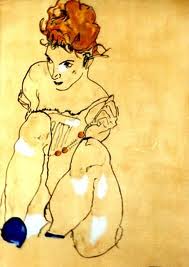
Looking at Lautrec's work encouraged me to look again at the work of Egon Schiele. His work is similarly loose and expressive. But in contrast to Lautrec,


 Schiele's work is often harsh in it's emotional depictions. While Lautrec may not prettify his subjects he does show us them with  more empathy which it's possible to see in the tender attitudes of pictures of women together in bed; quite often the prostitutes he so often painted.