Tuesday, 25 September 2012

Challenges of drawing animals

The main challenge of drawing animals, for me, is being able to draw sufficiently quickly. Unfortunately, too, I am not in possession of a pet although I did manage to borrow one for a few hours only. This was the dog belonging to my neighbours. He is a Jack Russell terrier and I found it difficult to draw him as he is constantly alert. In watching him, I decided that his ears were key to his behaviour in some way as they were constantly moving even when the rest of him was quite still. Anyway, I tried a few sketches but was not able to complete the final piece of work on large paper as I couldn't spend more time with him.

 
                                                          Sparky

Knowing that horses are in a nearby field I went there but they were some distance away except for one whom I photographed to produce the drawing that I later did at home. Finally, I decided to 'copy' some of the drawings by Ambrus in the set text. 


His drawings are full of character and I admire the way he captures the essence of them with so few strokes. Also, I tried to draw our garden squirrel. However, at some distance away he was quite small drawn 'sight size' and I felt unable to enlarge the size as I was not sufficiently confident in what the shapes might be.


Fish on a plate.

For this I looked at the fish counter regularly. I bought a rainbow trout and sketched it with its mouth open- I pushed putty into its mouth to keep it open. Looking at this way I thought how much like a reptile it looked. The colours were amazingly varied and depending on the light source changed.

For the final picture I decided upon mackerel.

 
I tried the composition in portrait and finally decided upon landscape format. Having looked at many 'fish' paintings I wanted to try to inject some 'life' into the fish - and that's why I tried the 'open mouth' approach but whether I succeeded is another matter. However, I like the colour palette in this drawing which I did with colour pencil. The onion at the rear is probably too intense a colour as I was trying to keep it more to the colour on the fish themselves.  Many still lifes from the past succeed in really strong, dark backgrounds and I like the richness of these old paintings but I am unsure as yet how to successfully draw this in and recognise that I am, perhaps, playing safe with background colour by keeping it fairly neutral.
 
There are, of course, many places to draw animals. The zoo comes to mind but also Natural History museums as well as farms. When I get a spare day I will try to do more animal drawings as I feel that I've merely touched a tiny surface. 
 

Monday, 24 September 2012

Stubbs

George Stubbs

Stubbs is well known for his paintings of horses. Less well known is the fact that he studied the anatomy of the animal assiduously. In fact, Stubbs had a childhood preoccupation with anatomy that developed into a major interest.

Stubbs apparently skinned horses and then studied the muscle structure in order to produce drawings that were representative of the animal's body. Further he looked at the skeletons of animals which he drew and eventually published for others to observe and use. Stubbs hoped this would be of benefit to artists but also to people who cared for horses.

Stubbs considerable knowledge of anatomy, gained in ghastly conditions, over several years, enabled him to bring a new standard to horse painting.


                                                    Drawing by Stubbs


It is considered that Stubbs knowledge enabled him to paint horses showing the effect muscles would have in tensioning the body in its different poses. This vitalises the animal whereas earlier paintings may make the horse appear more static. A comparison has been made of Stubbs' work with a painting by Van Dyck, for instance, an equestrian portrait of Charles1.


 Depicting a high spirited horse and at first sight convincing, critics have said that further study shows the Van Dyck  horse to be somewhat flaccid in its hindquarters and lacking conviction in that no underlying muscle activity is represented. 


'Whistlejacket' 1762 is a lovely painting of a horse by Stubbs. According to some critics this painting is an accurate representation of the horse that lends authority to the work. However it must be true that however much knowledge Stubbs gained of the horse his paintings represent more than accuracy, rather artistry is also at work. 

Stubbs was asked to paint other animals and his work contains a wide variety of dogs, as well as more exotic animals.  I particularly like this 'Zebra'.


Overall then, whilst accuracy may be an objective aim in animal studies, capturing the essence of an animal is  also important and Stubbs seems to have had both these abilities as well as helping others to achieve them. 
 
 
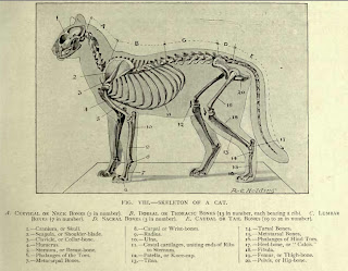
Images of a dog's muscle structure together with below the image of a cat's skeleton.


Negative Space and plants in A2

Negative Space in a plant.

 
It proved difficult to draw the negative shapes as I constantly wanted to revert to drawing the positive shapes. Looking at negative shapes will help in drawing because it enables further measurements to be made regarding proportion. As negative shapes do not have 'names' as such it makes you look at the shape itself rather than using the preconceived ideas that language labelling is capable of doing. Because of this accuracy is potentially made easier. Not only that but negative shapes are an important part of any composition. Looking at the image of a tree for example, the spaces between the branches are as important in the overall picture's design as the branches themselves. I think it's hard to remember the importance of negative shapes but recently read 'Lessons in Classical Drawing' by Juliette Aristides wherein she admits to having to constantly remind herself to do this despite knowing its importance. This is a reassuring admission as I know it's something I need to improve upon.
 
Three plants - proportion and 3D spacing.
 
For this part of the course I decided to draw two pots in my garden. I took my easel into the garden as I had  decided to draw whilst standing and looking down upon them. In order to create depth I placed one pot behind the other and worked hard to try to achieve the correct measurement for the ellipses on each as the forward pot would have the widest ellipse. It was also fairly foreshortened and it took me some time to work this all out. Having recognised that I wanted to draw the stones upon which the pots were standing this involved using perspective and I decided that the vanishing point would be off the paper. Consequently I tried to estimate where this would be and draw it accordingly.  In order to draw the plants in proportion I did several sketches first to work out where the pots would locate on the picture plane.


                                                 A2    Colored pencil 
     
This first attempt in pencil was quite daunting to me as the fine points mean it takes some time to build up the colour. The course instruction book suggested three hours or more but in the end I spent nearer seven hours on this. 
 
To help with the 3D effect I attempted to draw in the form tone on the pots and in keeping with colour theory made the front pot darker than the rear. At one point the whole thing looked really flat to me so I intensified the colour of the front pot by adding red to the brown and this, I think, helped bring it forward.  Initially I wanted the red peppers to be the focal point but, I think, the composition failed in this because of the pot  being more prominent than the plant and this is due to its size and colour strength.   However, the hosta does draw some attention as the light works across the leaves. I tried to make the front leaves on the pepper larger and more detailed to show they were further forward and in similar manner left the rear pot less detailed and lighter in colour.
 
The light in this was quite disastrous as I placed the pots in a position to draw and anticipated that the light would be right at the time that the initial drawing was done- during this time the plants were not in direct sunlight. However, at the time I expected the light to be coming to the left the sun in fact got too low to be on the plants. At this stage I decided to try to imagine what the light would have done and finished the drawing  in this manner. Consequently there are several errors. I couldn't do the exercise again using the same plants as I had managed to kill the hosta by putting it in a hot spot on the patio.
 
After this  I reproduced the drawing in pen and ink and then oil pastel.


I feel that neither of these is successful . I decided on the oil because I thought it would be easier to cover A2 paper size with better effect. Of course, this meant that fine detail was missing. The pen and ink was meant to be the best of both worlds, a pen for fine detail and a wash to cover broader areas. However, the paper was not a good choice as the washes were overdone by me and the paper buckled and what was meant to be a light effect was overworked by me.

Ben Nicholson

Ben Nicholson

(For the purpose of information in this research I am indebted to Norbert Lynton for his book titled Ben Nicholson, published by Phaidon and to Jeremy Lewison for his book of the same title published by Ediciones Poligrafa SA).

Why does he simplify still life forms and negative space and superimpose them on the Cornish landscape?

Ben Nicholson was the son of William Nicholson and Mabel Nicholson (nee Pryde). This start to Ben Nicholson's life, (hereinafter abbreviated to BN), has more than a small effect on his life and artistic work. Both parents were artists, and his father's collected  objects for still life works of his own; objects that BN not only grew up with but also inherited and used in his own work.

This is not to say that BN worked in a similar style to his father, far from it. In fact by the time BN was born an artistic world was being created in which a campaign was being mounted urging simplification in drawing. Tonks at the Slade was in favour of this and although BN was not long studying there under Tonks his work shows this influence in being less detailed.

Still lifes with scenes beyond windows were important in BN's work throughout his life and Lynton makes mention of the long tradition in Art of views outside windows as part of secular and religious paintings. Interestingly, although there are differences in BN's landscapes of the 1920's the picture space shows the traditional recession whilst the still lifes explore the flat plane of the Cubists.

Lynton goes on to argue that while landscapes have their own light still lifes have their own light although possibly artificially arranged so that the two genres can be seen as complementary.


Having been married to Winifred  Nicholson, also a painter, BN later formed a relationship with Barbara Hepworth and the 1930's were to be important for BN in many ways.  It seems that the work of this period combined BN's reliefs as well as painting.  The abstract reliefs convey a formal white purity that may demonstrate an adoption of Modernist trends and personally I do find these stark works especially satisfying. Later, BN said that these works were basic still lifes, the cut out circles representing a cup, the rectangle a bread board, a newspaper, a table top and so on. This fusion of abstract relief, apparently adapted from Mondrian, with still life show that BN was being experimental and would so continue and paves the way for further fusion of landscape with abstract relief.

'Au Chat Botte' is considered to be another important development in BN's art.


Apparently whilst looking into the window of this cafe BN became aware of the three different planes of space that were simultaneously located onto the one plane. In other words he could see the objects inside the cafe, the writing on the glass as well as the reflection of the things behind him. BN said it was impossible to see what was real and what was unreal and that this created some kind of space or imaginative world in which one could live. This led to the painting above and it's possible to see the potential that this, with the aforementioned relief work, could have on some of  BN's subsequent  works.

                                                St Ives Version 2 (oil and pencil on board)
In this work the cup and mug are shown in line and shadow recalling the reliefs combined with the simplified Cornish scenery beyond. Again, according to Lynton what BN enjoyed enormously in St Ives was the quality of the light, at one point in his life he had thanked Winifred for the luminosity of her work and now the light and landscape of Cornwall were again part of his life and one that he seems to have enjoyed immensely, even spiritually. Lynton says of this work:

'Apart from the motif and space game of the double subject there is, more vigorously than ever before the play of line against plane, pencil against paint.' And adds how much difference there is between the lines and the fatness of the grey cloud.

St Ives, version 2 was completed in 1940 and compares to Trendine (1947) and Mousehole (1947) in that all three are fusions of still life and landscape. However they differ in that in the latter there is not the clear distinction between the background and foreground objects as there is in St Ives.


Mousehole 1947


This is quite apparent in the work above and the still life objects look imposed onto the background scenery. Colour of palette unite the two but there is more confrontation here between the two genres
During the 1940s BN continued to complete work that shows sharp lines and soft tones with flat surfaces, apparently he described his own work as 'both musical and architectural'.


December- St Ives oval and steeple 1951

Looking closely at this work it's far more allied than confrontational - the soft grey blue tones and the pencil lines work their way across the whole picture and rather than being set against a window the familiar rectangles of the reliefs and earlier paintings are in evidence. I like this work immensely, to me this picture is calming and yet lively at the same time. 

Another work I really like is this:


                                          1955 Torre del Grillo, Rome- Pencil and wash
This depicts fruit and urns together with a balustrade and buildings with a wash of soft ochre.
Continuing to pare down his details Lynton argues that 'clarity and the great art of omission' are key to BN. 'A few lines can offer space, light and scale.' BN mentioned at one time that he found Mu-Chi's work to be most poetic.

                                                            Six Persimmons

It's certainly easy to see the economy used in this picture. But beyond that BN had a great love of landscape and said that the sky is not up there above us but rather it 'comes in and out of one's windows'.

He also is quoted as saying that rather than denying that anyone had influenced him he was willing to admit that he had been influenced by many people. And it's true that when reading about the life and work of BN so many important names from the history of art are encountered. In this short exploration of BN, I came across, and this is apart from his parents and wives, the names of Paul Klee, Cezanne, Picasso, Miro, Paul Nash, Kit Wood and not least, perhaps Alfred Wallis in Cornwall.

It's hard not to like BN when reading about him; his statement that an artist should make an object as 'living and as good as a poodle' and that art should be an 'active force in our lives'.
It seems he was born into not only a family of artists but at a major time in the history of art. So overall it's impossible in answering this question about BN's work to simplify, as he did in his work, an answer. Clearly his work developed as a result of several personal influences, his love of spiritual life and the era into which he was born which seems to have been one of great innovation in Art.   

Drawing fruit and vegetables

Compositions should take up most of the paper's surface. I didn't achieve this always and left negative space. From what I've read regarding color theory it seems that white always comes forward more than any other colour and therefore may become an undesirable focal point. In my defence I wanted to concentrate on the forms in front of me as working on the various planes within each item and not forgetting the overall tonal values was something I had to constantly think about.

Apart from learning, as mentioned above, that overall form shading must not be sacrificed I read that local colour is not always possible to depict if form is to be represented. It's quite amazing the amount of colour in objects when looking closely and I'm more than sure that I have further to go in seeing these hues. I have read that the highlight on a fruit or indeed anything else will not be white and that sometimes artists use the complementary colour in the highlight as well as in the shadow. I'm not sure of this yet as if this is the result of what we see in ordinary circumstances why do if  the eye will do it for us? Hopefully, this will become clearer in time and with further reading.

                                         Fruit bowl -oil pastel with 'sgraffito'
                                   Cooking apple, courgette -oil pastel

Another aspect of representing planes in items is that sometimes they shouldn't all be drawn. This is part of the selection process that needs to be made by artists and is crucial as part of the simplification process that stops 'overfussiness'.

Many fruit and vegetables are cylinders or spheres and are toned in the similar way of depicting the form for these. Ellipses often show themselves as part of the structure as at the end of carrots or strawberries.


                                             Pears- coloured pencil

Challenging aspects of this part of the course include what I have written above as colour theory together with using different media were tackled at the same time as 'looking hard' at the planes in each object. It's almost as though instead of drawing, say one pear with form you're drawing several forms on the one pear but having to remember the overall tonal value at the same time. Doing this whilst trying to technically manage colour media with little experience meant high levels of concentration were required. Hopefully this forms part of my 'learning to see' that will improve my skills and while I don't like all my work I am able at times to imagine I see an improvement.  


I've added these two drawings as although neither fruit nor vegetable I was quite pleased with how the coloured pencil seemed to work well for this subject. Unfortunately, although I liked the stark white background I was aware of the need to think about adding a background and decided on a soft lavender colour. In the process I spoiled the effect and in consequence the drawing 

Still life using line, tones, stipples

Still Life using line


This drawing was a selection of objects from the beach at Mersea.
 
Aware from my reading that masters such as Ingres and Matisse could increase the pressure on a line I decided to use a dip pen and attempt the same.The composition was set up by using the pebbles from my drive placed on a baking tray with the objects on top. I begged some rope from a local hardware store and added this -it was thick and I coiled it around about. 
 
This didn't work- for several reasons- I decided that the rope should diminish in size as it went away but I wasn't sure by how much. Consequently when I drew the two stones the whole image changed to look like a beach scene and the stones looked like distant cliffs. This looked even stranger as the rope looked as though it was out to sea.
In an attempt to compensate I increased the line on shells but then noticed that I'd placed some objects 'kissing' instead of overlapping which is a basic mistake. Despite all of this I quite like the finished drawing as the strong pen lines around the shells have a clarity that is pleasing to my eye.
 
So, all in all, lots of errors in perspective and could have been much better.
 
Still life in tone
 
 
For this I decided upon coloured pencils. I chose rounded objects that wouldn't require much line work. However I found it almost impossible to draw the ellipse at the top of the jug without resorting to line. I depicted the flowers by toning the background area and left the petals as the paper showing through. I felt I created a sense of depth by placing the pears as overlapping and by shading down the jug. I decided on the colours first by working in the sketch book.
 
Working in tone without line is difficult if fine detail is desired and working in line without tone creates problems of light and shade contrasts and perspective. Seeing the work of master draughtsmen shows, though, that  these problems can be resolved with the requisite skill, not necessarily to the level of the masters.


Leonardo and Paul Bartlett -2 masters of detailed drawing

Leonardo da Vinci

Leonardo (1452-1519)

A renowned master, Leonardo showed talent for drawing at an early age and was apprenticed to a studio in Florence. Apart from drawing wide ranging subjects Leonardo is famous also for his designs and inventions which together  show his genius. Apart from drawing he was, too, a scientist, sculptor and teacher.

At the time of the Renaissance drawings were not valued in themselves but were seen as a means to an end. Leonardo's sketchbooks and notebooks show an unlimited curiosity in the world around him as he made copious notes.

Media

Apparently Leonardo combined media and would use charcoal, chalk, metalpoint, pen and ink,  a damp brush for shading and white chalk for highlights. His most significant usage was pen and ink on unprepared paper.
Chalk was favoured for landscapes or he used  pen and ink. For human heads and hands he would use red chalk on pink paper. Paper was an expensive commodity at this time and Leonardo crammed as much use as he could into each page.

The quill pen that he would use was sharpened with a knife and could be used to make a broad down stroke and a finer up or side stroke.

To his line, tonal washes were sometimes added to emphasise detail but this wash was kept lighter than the shading line. Similarly subtle tones were created with a damp brush to chalk drawings whereas drapery folds were shown with deep black.

Metalpoint is used on a prepared ground and the work is drawn by going over the same line frequently. It cannot be erased but nor does it smudge and this method was used by students who once they had finished a piece would reground the support for a fresh drawing. Silverpoint turns to a deep brown over time so is not similar to graphite.

Movement

Many of Leonardo's drawing convey movement and this is obvious in these works below.


Christ figure
 
  Star of Bethlehem

 Both these drawings show the use of spirals which figure often in his work and convey great energy. Line was a fundamental part of Leonardo's technique and he made great use of hatching either in straight or curved lines as well as crosshatching. In some works it's possible to see the effect of bringing a line from the background across the contour of the subject in front which helps to distance that part of the subject matter and thus create distance.

Leonardo wrote six books on light and shade and the use of perspective reached a peak during his lifetime. Foreshortening and aerial perspective, whereby  colour diminishes as distance increases and less focus or clarity is shown on background objects in proportion to depth required, was brought into his work.

Leonardo was not shy of using rulers to draw perspective lines and to square up a piece of paper. Some of his work show the measurements that were put beside subject matter.


Many drawings evidence the painstaking detail undertaken by this man.
 
Finally, regarding chiaroscuro, light /dark shading, many of his works show a soft blend of shadows rather than an extreme and it has been written that he coined the term sfumato, to suggest that changes in tone should be invisible.
 
Diverse and comprehensive books have been written about this man and his work so this is a very short post . Hopefully it covers many aspects to be considered when looking at the works.  
 
                                                               -----
 
 Paul Bartlett (1955 -)
 
Initially I found it difficult to decide upon another artist showing mastery of detail. Looking at many images in books and on the Internet left me wondering where they were. I could see that in the US many artists choose detail but many of these works did not inspire me because they seemed rather flat and lifeless ( this is a huge generalisation based on limited research). However, when looking at Ian Simpson's text on drawing skills I noticed Paul Bartlett's name next to an illustration and decided to look further.
 
Based in Birmingham, Bartlett has studied art at various schools and has produced work in a range of media. There is definitely detail in his work as this drawing shows.   
Lynda in the Life Room
However having seen it only on screen it's hard to see the techniques used. It certainly makes use of tone as well as line and there is lots going on in the surroundings. In the drawing below there are certain similarities to the swirling hair seen in Leonardo's work above.

  Patricia with hair up
 
This drawing too has a similar sense of movement .
 
 
 This is one of Bartlett's prints and is a mass of detail with a strong sense of 
pattern. The line work is apparent and the tonal work varies to a rich darkness in places but again it's the sense of everything moving into the circular centre that gives it such vitality.


Bartlett is a member of the Birmingham and Midlands Pastel Society and the above two works are in this medium. Bartlett says that he likes to portray family life and he does this with affection in 'Main Mother' and 'Father Sunday Papers'
They are quite different in their treatment and this seems indicative of Bartlett's work - ranging from charcoal to pastel, printmaking and graphite.
 
Finally this portrait entitled 'Astronomer' which is in pastel pencil and colour pencil.

 
This shows again an artist varying his style and the subject portrays a mixture of emotions to me. Seeing the telescope in the background, where the title undoubtedly comes from, the naked man looks vulnerable and wistful as though he's been stargazing and is disappointed that he's not reached the stars 'in life'. The hair is straighter in this depiction and it's just possible to see the dark shading around the rib bones which, with the shadows under the deep set eyes, add to the atmosphere. Unfortunately I cannot quite decipher the two figures apart from recognising that a man and a woman are represented but this would accord, perhaps, with the subject's regret. Finally this work is interesting in the choice of crop and the angle of the head. The foreshortening brings the chin to the front plane of the picture frame so we are looking down on a downturned chin and closely closed mouth again adding to the emotional atmosphere. Overall I like it immensely.


Wednesday, 19 September 2012

Drawing - line, tone, and stipple- page 50

Line drawing in fibre tip pen

Pine cone


This continuous line drawing was done in fibre tip pen. I found it difficult to not lift the pen from the paper and managed with two lifts. The fibre tip bleeds even on card so there were some 'blobs'. When I finished this I couldn't resist some lines and shading. I found the felt tip allowed broad bigger strokes but found it difficult to vary the width of the line. Also I found it difficult to draw larger than sight size but overall was not too displeased with this effort. 

Tone/depth detail - Shell


This took me two hours to complete and I used a range of pencils H, B, 2B and 4B.
I tried to make the 'bumps' on the shell a focal point and constantly returned to it to darken the shadows. Also I strengthened the front edge line as being a shell I thought the hard edge would work.


Stipples - cauliflower


For this drawing I used a Zig pen 0.3 size. Having trialled this in my sketch book I realised that it can be easy to 'get lost' in the stipples and to forget where the darker and therefore denser areas of stipples should go. This drawing took two hours .
 
The felt tips were easy to use to achieve a wide line but not east to control; the fine line pen is ideal to create fine dots without smudging and graphite pencils lend themselves to hatching and smudging and are versatile medium.
 
I enjoyed all three of these drawings; however stippling can be very time consuming.
I don't feel ready to admit a preference of detail over broader work or vice versa. Detail at time seems challenging and possibly more interesting. However I think that achieving broad strokes to achieve energy in a work probably relies upon a good working knowledge of how to achieve detail.
 
Composition.
I'm not sure how the composition of these could have been improved as the instructions on how to go about them were fairly rigid. Size seems to be a constant motive in the instructions and perhaps, for example the shell could have been done with less white space and I suppose the cauliflower could have been larger too. However with the latter I tried to obtain a good viewpoint by angling the vegetable slightly in order to make it look 3D.
 
Finally the problems I had with the felt tip made it difficult for me to concentrate on space as much as I would have liked. I redid this drawing several times in order to learn how to overcome this but decided that the medium was not the best for this task.
 

Coloured Media

Which media did you find most expressive?
Lends itself to detailed work and are most enjoyable to me?


For this part of the course I tried coloured pencils, Inktense pencils, oil pastels, felt tip pens and markers, watercolour pencils as well as coloured inks with dip pens and pastels.

Overall I believe it's difficult to suggest that one media is more expressive than another as although something that lends itself to working quickly can produce what I would call an energetic drawing with vitality, it's possible to be expressive with a fine point. It surely depends on the outcome desired.

Very detailed work is made easier with finer points such as coloured pencils and pens where small areas of detail can be achieved.


I enjoyed the conte crayons, as indeed I enjoyed many of the media that can be used quickly. However, as mentioned above detail may be more difficult to achieve. I believe conte crayons can be sharpened to a point but I suspect that this point would soon be lost. Oil pastels similarly soft in texture are versatile as they can be thinned with turps or built up and inscribed into with a sharp point to reveal a colour beneath. I used this 'sgraffito' technique when I worked upon the fruit and vegetable drawings.

Pastels produce lovely effects but look poor if overblended and I am well aware that I have a tendency to overwork many media and know I need to keep guarding against this. Knowing the colour of paper to use is another area that requires more experimentation.

I found it difficult to blend the colour pencil work and have not yet found an answer to problem. Paper quality and texture is important in various ways and I wonder whether I have not found the right paper yet. It seems many US artists use a paper called 'Stonehenge' to produce highly blended work as well as using solvent to dilute the pencil pigment.

Overall it's difficult to name a favourite yet. I must ensure that media producuing broader strokes do not lead me astray into working too quickly and without discipline.
Continuing experimentation is important with mixing media to see what happens. For instance I liked an effect of oil pastels with cheap felt tips as felt tips are very bright and the oil pastel cooled down the colour and seemed to give more depth. Felt tips and fine liner pens was another combination I liked. Again the fine hatching over the bright flat colour worked well.