Compositions should take up most of the paper's surface. I didn't achieve this always and left negative space. From what I've read regarding color theory it seems that white always comes forward more than any other colour and therefore may become an undesirable focal point. In my defence I wanted to concentrate on the forms in front of me as working on the various planes within each item and not forgetting the overall tonal values was something I had to constantly think about.
Apart from learning, as mentioned above, that overall form shading must not be sacrificed I read that local colour is not always possible to depict if form is to be represented. It's quite amazing the amount of colour in objects when looking closely and I'm more than sure that I have further to go in seeing these hues. I have read that the highlight on a fruit or indeed anything else will not be white and that sometimes artists use the complementary colour in the highlight as well as in the shadow. I'm not sure of this yet as if this is the result of what we see in ordinary circumstances why do if the eye will do it for us? Hopefully, this will become clearer in time and with further reading.
Fruit bowl -oil pastel with 'sgraffito'
Cooking apple, courgette -oil pastel
Another aspect of representing planes in items is that sometimes they shouldn't all be drawn. This is part of the selection process that needs to be made by artists and is crucial as part of the simplification process that stops 'overfussiness'.
Many fruit and vegetables are cylinders or spheres and are toned in the similar way of depicting the form for these. Ellipses often show themselves as part of the structure as at the end of carrots or strawberries.
Pears- coloured pencil
Challenging aspects of this part of the course include what I have written above as colour theory together with using different media were tackled at the same time as 'looking hard' at the planes in each object. It's almost as though instead of drawing, say one pear with form you're drawing several forms on the one pear but having to remember the overall tonal value at the same time. Doing this whilst trying to technically manage colour media with little experience meant high levels of concentration were required. Hopefully this forms part of my 'learning to see' that will improve my skills and while I don't like all my work I am able at times to imagine I see an improvement.
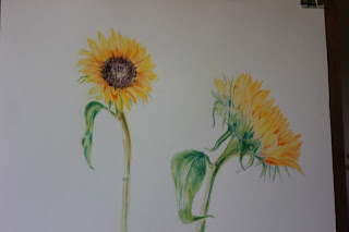
I've added these two drawings as although neither fruit nor vegetable I was quite pleased with how the coloured pencil seemed to work well for this subject. Unfortunately, although I liked the stark white background I was aware of the need to think about adding a background and decided on a soft lavender colour. In the process I spoiled the effect and in consequence the drawing.


No comments:
Post a Comment