Wednesday 3 October 2012

Final composition Part 2

Final composition - part 2


I struggled with this final piece of work and for a number of reasons. Initially, this was set up on the window sill. The windowsill is 'white' and so is the jug containing the flowers. With the light of the glass behind, the whole composition would be very high key if I left the colour as it was, which I considered doing in shades of grey with a contrasting strong colour for the flowers. However as this is an exercise in colour I decided that this would be unsatisfactory and so started thinking about colour schemes.

I had decided upon colour pencil as detail was required and tried this on smooth Fabriano paper. However, the coloured pencils I use are Faber which are oil based and harder than other wax based pencils. Consequently, when I tried to depict the glass with large hatching strokes the whole thing looked too busy and was competing with the flowers.

Because of this I tried a quick sketch in different coloured inks with pen but found it too insipid so went back to my first choice of medium but decided to include watercolour pencils for the larger background areas and for some detail on the petals in order to try to gain a looser, transparent look. Consequently I used a watercolour paper to take the washes.

Before moving to my final choice as above and to overcome the lack of 'colour' I thought it would be interesting to try the drawing on grey pastel paper but this made the whole thing look too heavy. So as well as deciding on the coloured pencils I decided too that white paper would be best.

The next concern was the colour palette. I wanted to limit the colours but stay with the local colour of the flowers. As the flowers were drawn in a blue red I thought the tone on the window frame could be done in blue in order to keep a harmony. The jug was done in shades of brown for warmth and contrast and complements the blue as does the wall colour of a slightly lighter shade of brown. I was hoping that the colour of the jug would bring it forward but not detract from the focal point of the flowers. The background glass is done in a very weak blue wash over which I tried to hatch white colour pencil to create an effect of glazing. This was unsuccessful.
I'm not sure if the back of the window frame is correct?
Although aerial colour perspective suggests that colour should fade as subjects move away this part of the window was in the deepest shade. I've looked at this part of the work often but cannot decide whether or not the colour is too strong here.
For some reason I had it in mind that the object for this assignment was a vase of flowers and I became keen to portray the lilies. However having done much of the work I realised that other objects were meant to be part of the composition. And that the other objects should be 'found' as were used earlier. Considering this omission and how to rectify it was difficult as I thought the picture could look too cluttered. Also, because the lilies are fairly exotic looking I thought that English countryside items would look out of place- I did put one other object on the shelf and left it at that.  

I hope that the perspective as well as the colour gives an impression of depth. The vanishing point was off the paper and I tried to work it out correctly which I thought important as I knew that buildings were coming up in the next part of the course.

Overall, I believe my work has improved during the course of this unit and I have learned a lot about colour theory and different media. 

Tuesday 2 October 2012

Animals- Leonardo, Durer.

 
 Durer


It's hard not to like this splendid specimen which Durer drew without having seen a rhinoceros but from a description given to him at third hand. What it shows is Durer's close attention to the detail of his drawing which is similarly evident in this famous drawing of a hare.

 
This drawing reveals Durer's reported interest in science and was completed in 1502. The fur detail was painted over a colour wash to give an impression of fur and underlying structure. Apparently, Durer usually worked in three stages. First brushing in outlines, then colored areas finishing with the more detailed work.


This 'Wing of a blue roller' was completed in 1512. It is watercolour and opaque on parchment. Wing joints are rendered anatomically correctly and it's thought that he may have used this study for modelling angels' wings.
 
 
Finally I've included this almost walrus drawing; a 'Head of a Walrus' in ink and brown Indian ink. Durer is quoted as saying 'the more accurately your work represents life, the better it will appear...' Durer's love of detail is shown in this drawing which appeals to me in different ways. At times I find the expression almost fearful and at others almost comical. This drawing together with several others is held in the 'British Museum' though I suspect not on display as they are probably too light sensitive.
 
 
Leonardo was a scientist as well as an artist and his drawings of animals show this interest in the same way as do his studies of human form.
 

This drawing of a horse is one of many studies made but his interest was all embracing and he drew dogs, cats lions and grotesque animals.


The study of horses is indicative of Leonardo's ability to convey movement whilst the lower image of a page from his sketchbook captures characteristic poses.

Tight rigorous work/Expressive styles of artists' work

Ingres- Toulouse Lautrec

In the 19th century divergent views of art were leading to different styles. The academies continued to teach drawing in a traditional way which was supported by Ingres amongst others. However there was a growing number of artists such as Courbet who thought that the schools were superfluous. By the end of the 19th century fresh ideas were developing as the modern era of photography and psychology brought  new styles into the world of art. The Bauhaus was opened in 1919 in Germany which united art with design. The revolution in materials helped create new works and mark making became sufficient in itself as a reason for a work. In Vienna, Schiele, amongst others, was thrown out of the Academy for demanding reforms in teaching. 

As Ingres supported the classical methods he could be said to follow a disciplined classical style or neo-classical style. This style is one that carries the idea that 'art imitates life'. The ateliers taught drawing by asking students to draw plaster casts of figures or sculptures until they reached a point when their skill was refined which entitled them to enter the life room.  

However, there is no doubt when looking at Ingres' portraits, and there are over 400 extant, that we feel that we are looking at a true likeness of the sitter.

 
This portrait by Ingres of Alfred Emilien typifies his work in that it draws our interest to the subject's face. It is darker and drawn with finer detail than the rest of the figure which seems more loosely drawn, with hatching strokes clearly visible, and has  less tonal variation. However, the clothing serves to reveal the underlying form of the subject. The curve of the cuff and the tightness of the jacket, showing the material's creases, reveal to us the shape of the man's body. Apart from the precise features another typical characteristic of Ingres' work is in the firm outlines, quite clear in the lapel of the jacket.

This  drawing which I was fortunate enough to see this year at the Fitzwilliam Museum in Cambridge is in many ways similar in style to the one above.  I was surprised when I saw it at how delicate it seemed in its execution. Ingres enjoyed using graphite on wove paper and often squared up his images for final execution. The detail of buttons on the right hand jacket is remarkable in its detail.

As these drawings show there is little difference in the way Ingres worked on the portraits which he supposedly disliked doing, but which earned him a living. I like the way the faces are the centre of interest and command our attention and note that this technique has been used by other artists such as is seen in the one below by Hockney.

margaret                                ken
 
Toulouse-Lautrec.
 
I've chosen Toulouse Lautrec as an artist whose work shows a more 'expressive' style. However, the line from Ingres through Degas to Lautrec in a way epitomises the way art styles were developing at this time. Degas very much admired the work of Ingres and followed his style under the guidance of Lamonthe at the Ecole des Beaux-Arts. As time passed Degas' subject matter changed and along with this so too did his techniques change. The colour of his palette gave way to brighter colours and the naturalistic style of former works became  looser, with bolder strokes and more abstracted form. Degas used photography and would use this to capture the images of dancers for which he is renowned. It is in this respect that it could be argued that Lautrec followed Degas by becoming a painter of ordinary life.
 
'He wears my clothes, but cut down to his own size,' is a quote attributed to Degas about Lautrec. A somewhat cutting remark?
 
Lautrec's subject matter was modern life; the world of ordinary working people found in laundries, brothels and, of course, the dancers. And similarly to Degas, it's possible to see the influence of Japanese art on Lautrec.


This influence is shown by a lack of shadows and the diagonal split of the picture plane, both of which can be seen in the composition above. Lautrec's family were keen riders of horses and he grew up in an environment where horses were commonplace. Consequently many of his early works were of horses but it's the energy of the image that stands out in the depiction of the horse above. The exaggerated angle borrowed from the Japanese woodcuts can create a particularly expressive effect which Lautrec utilised to full advantage.


                                                       Yvette Guilbert
 
The subject of the above work was frequently drawn by Lautrec. The black gloves became a defining and stylised feature of his drawings of the singer. Whilst Guilbert initially disliked the images of her by Lautrec because they did not prettify her it is now considered that Lautrec captured the essence of his sitters in just a few strokes.
 
Photography provided an accurate or objective representation so it was the job of the artist to convey 'thought' and 'feeling'. Distortion and leaving pictures unfinished or loosely done could reproduce this 'truth' more than naturalism.
 
Being blighted by ill health and  alcoholism it's thought that Lautrec was fascinated by the energy of dancers.
 
                       Chocolat Dancing in the  Irish and American Bar
                                Indian ink, crayon watercolour on paper.
 
This drawing has been achieved with very few lines, very loosely drawn and most of the paper surface is showing through. It is not an attractive drawing in the conventional sense but it captures the elegance of Chocolat, the animation of the musician and the tedium of the barman. I like the way Lautrec is able to suggest emotion whether it's boredom, despair or debauchery. Also, I really like the colours used by him. The intensity of the nightclub scenes is shown in blues and blacks often with touches of orange hair. Whilst the faces of the clientele are stark white under the artificial light.
 
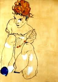
Looking at Lautrec's work encouraged me to look again at the work of Egon Schiele. His work is similarly loose and expressive. But in contrast to Lautrec,


 Schiele's work is often harsh in it's emotional depictions. While Lautrec may not prettify his subjects he does show us them with  more empathy which it's possible to see in the tender attitudes of pictures of women together in bed; quite often the prostitutes he so often painted.