Wednesday 25 April 2012

Redon

Redon (1840-1916)

French painter and printmaker.

The Smiling Spider 1881


Redon is quoted as saying that he would describe his work as 'ambiguous', that his drawings are to inspire and not to be defined. Working at the time of the Symbolist movement and the idea that art should be for art's sake and not to carry a moral message, Redon's works surely show facets of both of these.

The work above is curious and clearly not of the natural world and whilst it may be an interesting composition I have to admit it's not to my liking. But then I don't like spiders and the grotesque smile on this dancing creature just adds to its horror to me.

The Trees

Redon enjoyed making many drawings in charcoal and he titled these works his 'Noirs'.
In fact, when reading about him what comes across strongly to me is how much he experimented in materials to obtain black. There is available a 'Technical Investigation of Odileon Redon's Pastels and Noirs' available online and is interesting as it shows how scientific methods have been used to analyse his materials. Apart from vine charcoal Redon used black crayon, black chalk over broad tonal passages to outline and black pastel to produce intense blacks over grey or brown. The charcoal he dipped in linseed to produce a warmer tone, but this has soaked into the paper over time and changed the colour of the paper. He used, too, ground charcoal which was erased to produce forms and to create a sense of distance.

Redon was influenced by Rembrandt and his chiaroscuro techniques and the light/dark juxtaposition to create beings is evident in his drawings, as is a sense of sinister mystery which I think comes across even in the image above of two trees. They are almost personified; it wouldn't be surprising if they came to life as in children's horror stories. I like this drawing,Trees, much more than I do many of Redon's strange creatures, his one eyed Cyclops for instance and I think the reason I don't like them is because some of them convey a vulnerability, a pathos, that is uncomfortable.
In 1890 Redon moved towards a colour palette and used colour over charcoal underdrawings


Flower Clouds 1903
pastel with stumping, incising and brushwork on blue grey paper

This is a lovely, sensitive work of delicacy. Particularly lovely is the light in the flower clouds with their reflections in the water and with depth. And whilst Redon created many paintings that are ethereal in nature and not always to my taste I would appreciate seeing them in actuality as the online images are bound not to do them any justice.   

Just looking again at the online images of Redon's work and wanted to add this one.


Looks so simple, but brilliance of colour in the flowers and the black outlines of the vases make it
compelling. I assume it's coloured paper in the background - in style a long way removed from 'The Noirs'.

Eric Ravilious

Eric Ravilious 1903-1942

'The superb delicacy of line clearly defined between planes of flat colour,  ... is a direct echo of Barna's murals.'   and is typical of his work.

(The England of Eric Ravilious - Freda Constable).


                                                                 Chalk Paths 1935

I find this work beautiful in its calm depiction of the English countryside; the contrasting light of the path, the rather sombre sky, the sense of solitude and the graceful curves. It is typical in that it reflects a colour palette often seen in Ravilious' work and also in that it shows the line work as quoted above.

Ravilious studied design and was taught by Paul Nash who was interested in the then enthusiasm for wood engraving. So Ravilious' output includes many illustrations and design pieces, and it is this training which possibly accounts for his interest and continuing mastery and use of line in his watercolours. In Malcolm Yorke's book 'Edward Bawden and his circle', he says of Ravilious, 'Wood engraving had taught him to value clear boundaries, crisp focus...,variety in mark making, sound design and precise drawing.' He continues that Ravilious was fond of 'sponging, scratching, stippling, cross hatching wax resists or parallel strokes to achieve textures on furrows, ..skies or grass...but never overworked the surface...allowing plenty of white paper to show through'.
In addition, when Ravilious travelled in Italy he was admiring of Barna da Siena's  work which makes use of line and flat planes. Even so at first glance I thought I could see the influence of Nash in terms of colour and composition.


Paul Nash
                                                             Wood on the Downs -1930

It is possible to see the resemblance in these two works but Constable in her book suggests that Nash kept 'a distance between himself and his subject' whilst Nash was 'more open to the mystical experience' of nature. And it might be credible to argue that Nash would never have produced a work such as 'Strawberry Nets', (1932) which clearly demonstrates the use of line in the nets above the plants and in the outlines of the plants themselves. All done with a fineness and an amazing sense of light coming through from the sky above. There are many works demonstrating Ravilious' use of line as well as his interest in the juxtaposition of the natural world with the man made - as witness above the wire fence. Also his works showing interiors such as 'Farmhouse Bedroom' (1939), and 'Train Landscape' (1939),  both of which show the use of pattern often seen in his work and which I feel must have come from his design work.


Strawberry Nets
                                                                                                                         Train Landscape

Ravilious, as many of his contemporaries, was called to be a war artist and sadly never returned from an expedition. His war work continues to show the use of design and pattern but I find it much darker in its expression and whilst Constable may argue about his objectivity this war work conveys menace to me, and I think, rightly so.  

Living in Essex, not far from where Ravilious and Bawden shared accommodation,  I know many of the places they used in their paintings and this makes it even more interesting to look at their work, although from more of a social history point of view in this case. The 'Fry Gallery' in Saffron Walden' exhibits works from both these artists and is well worth a visit from anyone liking their work. Neither Ravilious nor Bawden seem to be widely known artists in this country and it's a great shame. I really like the work they produced and can't help wondering whether it's because they studied design rather than Fine Art that they are relatively obscure.

February/March Different media, Van Gogh, Tonal work

New Media

Trying the different media was an interesting and informative experience,

I've always liked the effect of charcoal drawings and found that I enjoyed the marks this made and the way it blended. However, being an untidy kind of person means that I have too work quite carefully to avoid smudging.

Felt tip pens were not to my liking as much - I didn't like the way they bled into the paper but I did like the fine artist pens. I found these to be very even in the marks they made and can imagine they are good for hatching evenly. By contrast a bamboo pen dipped in ink create splodges and thicknesses of line that are not always controllable but I like the energy they give to a mark.

All in all this exercise shows how many materials are available and that thinking about what to use in terms of both mark makers and the type of paper needs to be considered when setting out on a piece of work. The combinations are so plentiful that at this early stage it would be sad to limit oneself to a few tried and trusted types.
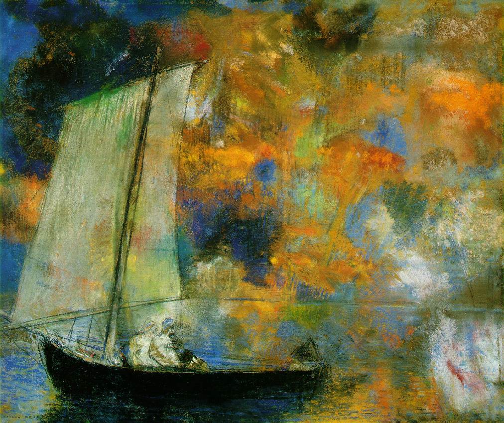
Van Gogh

This artist liked trying different materials and experimenting with them but I can see why he liked using these bamboo pens.

                                     (Van Gogh drawing and an attempt by me to copy it).

Reading about van Gogh's life and work shows how hard he worked to learn drawing. His personality conveys itself to me as a man driven to create art and to improve. His energy and commitment come through in these drawings and his work shows his originality in making marks to create what he wanted to show. He is an inspiration to someone learning to draw in the way he drew the same things over and over again. His marks included dots and dashes, curly squiggles as well as line that varied in its thickness. (Foe a particularly lovely and informative book about van Gogh's drawings see 'Van Gogh The Maste Draughtsman by Sjraar van Heugten).

Holding a pen or pencil near its tip enables small detail to be drawn whilst holding further along the shaft seems to create more freedom and energy. As above bamboo pen and ink seems to convey vitality but so does charcoal. Quick circular movements do the same.
Never having used pastels before I was a little frightened of them but tried them with interest on some coloured paste paper. They are very easy to blend but also very easy to overwork and so if a drawing is not going well it's difficult not to keep fiddling and deaden it. This is one of the difficult areas for me - when trying to convey something accurately I tend to overwork until it looks fussy. I'm hoping that this combination of looseness and accuracy will come with practice.

I found all the experiments interesting because it does show you how until you've tried something it's impossible to know if it will work for you. So for me the result is to keep trying new materials and combinations - certainly until I have a greater knowledge base and can make a more informed decision. 


Supermarket Shop.


I tried pastel for this drawing and believe I created the correct proportions. I overlapped the objects to create a sense of depth and used tone to create a solid 3D look to everything. However I didn't know what to do with the background and ended up almost 'colouring it in'. All in all though I was quite pleased with the overall effect. This exercise was done after the books and jars exercise so I tried hard to get the perspective right and to work on the ellipses.


Jugs and Jars

Books

Initially, I thought that whilst the ellipses were difficult the books wouldn't create too much of a problem. How wrong can you be? A lot of people know that train lines converge when getting further away -basic one point perspective. And I had read Ian Simpson and looked at his sheets of card several time but still the penny didn't drop that here the problem is two lots of perspective. I could have done this again but have kept it to remind myself of the problem- with perspective and me!


Tone and Form

Tonal Studies


I didn't quite understand the instructions for this exercise but hope this version is correct.

I found it difficult to distinguish between the light sources but easier in the shadow areas. Also, I found that it varied depending on the local colour of the object and the material from which it was made. On the wood it was difficult to see as there was little reflection at all. Clearly an awareness of light is very important to depicting form but careful looking is essential.


When looking at light reflected from one object to another -


as in this drawing in pastel- initially I had drawn a stronger highlight on the pepper's side as I could see the light there. I had placed a white piece of card next to the pepper and it was only when I removed this to look again that I realised that this was a reflection from the card. As this light cannot be as strong as the main light source I reduced the intensity of the highlight and saw that it looked better immediately.

Reflected light and shade.

                                                      Charcoal and putty rubber                                                             

This drawing consists of two stainless saucepans and a glass pyrex bowl. I can see that the bowl looks rather weird (ellipses?) but the attempt at the light and shade was really useful as a way of making you look more carefully. I tried to show the light following the contours of the objects by blending them into different lavels of tone.

Depicting man made objects.

Suggesting three dimensions on man made objects, which can be a definite shape may mean they need to be accurately drawn. Here, I'm thinking of bottles which need symmetry both sides and ellipses. However, natural objects, whilst sometimes being more randon in shape may present different problems in depicting texture

Depicting solidity in composition requires several considerations. Depicting form with hatching or some other tonal technique; overlapping forms to suggest depth; ensuring shadows and light are well realised . I'm not sure that changing the arrangement of the composition makes a difference to the approach as the sense of form must still be depicted. However the fact that this question is being asked makes me think there must be a better answer than the one I've just given, so I'll try to remind myself of this and keep thinking.

Positioning oneself and the objects is intersting in that I saw a drawing of a man who had been shot and the artist had chosen to place the eye level way above the subject so that you got a sense of looking down on him- just as you would if he were lying on the ground and you are in a position of dominance. Similarly then placing the eye level lower must make a drawing more imposing and depends on the subject matter and the effect you want to achieve. When I placed the plate of fruit at eye level itself there was little shadow effect to see so form was difficult to observe.
In this instance I chose the position that I thought gave most opportunity for light and shade but keep the above point in mind as it's not a once and for all situation.


Frottage Techniques

Having read about Max Ernst and looked at some of the drawings he created using this technique I started the project on texture.
To start with I tried to get an impression of my oak floor but found that the paper was too thick so tried thinner sheets. Also, I found that a soft pencil was necessary to be successful, or graphite sticks, but read that charcoal powder works very well in some cases as it falls easily into all the grooves or impressions. I started again and tried wood and  wicker. The wicker I found interesting as it was a chest and the long supports looked like elegant flowers as frottage. In fact they reminded me of delphiniums, one of my favourite flowers. However what intrigued me was how to incorporate frottage into a drawing. With thin paper not necessarily being first choice for a work. In the OCA work book on page 36 it looks as though Ernst has stuck the frottage on the paper, or is it the pear?  Although in other works he has used several impressions to create a work with seemingly little other drawing (see La foret petrifiee).
I popped into our local DIY store too and grabbed some samples of wallpaper that had deep textures to them and played with these. I could see how some of these could be used in a work as background textures. I think too that frottage could be enlarged to gain a really close up sight of different textures which would be interesting to copy or to draw large.
One book I looked at suggested ways of incorporating frottage into an observational drawing without it looking as though a subject was sitting in the air rather than on the texture -eg this was eggs drawn on a plank type table top. The eggs were drawn first and then placed over the wood to ensure the composition worked. (see Eggs on a Table by Martin Davidson). 

Objects with texture.

In my sketchbook I used an avocado stone -this had very little reflection and was quite flat. I tried coloured pencil and decided for my second attempt to keep the pencil layers lighter as light was still needed to come through the paper. Also tried the peel of the avocado as it is very dark with very deep channels. After I considered that it is probably easier to erase the highlights than keep trying to draw them. Carrying on with the fruit theme I attempted pineapple skin and banana skin. There are a few things I attempted that caused me problems; one is wicker as when I tried to observe it I felt that I kept losing my place. I know that drawing includes problem solving and I need to find ways to simplify these complicated textures. Hopefully, when I come to the unit on trees this will help me in this endeavour. The other problem was with a teddy bear. This particular bear has short, smooth fur so didn't give me any ideas on how to suggest his softness. Felt that his outline needed to be in a soft pencil and quite 'uneven' to suggest the fur. However, haven't got it right yet but will persevere.

Enlarging a simple image.

The grid itself was a problem - if it's not square it won't work. However as an exercise in enlarging an image I cannot see any problems with it. And copying the lines was not too difficult. Adjustments can be made if wanted as it's still your work. I read that Ingres often used grids for his drawings, placing a padded sheet over his final paper to protect it. When you look at some of his work you can see still the squares marked out. 


Assignment 1 -Man made and Natural objects

Assignment - Man made objects

When I saw that the first assignments were to be done on A2/A1 paper I felt nervous. Never having used such a large size paper before was awe inspiring. However, I began to consider, as I carried on working, that the aim of this is to ensure a looser style of drawing with not too much detail -especially as the handbook said that two hours should be enough time to complete the work. or thereabouts. And I  noticed that the next part of the course suggested the use of more detail on A3 paper.

Anyway to accustom myself to this size I did many of the exercises prior to the assignment on A2 and found that I enjoyed using it. I haven't yet tried A1 but this is to do with the sheer logistics of it.
For the composition of man made objects I spent a lot of time thinking about it. Initially I was going to draw my tennis equipment as I love these items. (Strange to some people, I'm sure). However I became less enthusiastic about this after a few sketches and carried on deliberating. My next idea was to draw bottles. This came about because I enjoyed looking for the reflections on earlier exercises and thought it would be a challenge, but after a few sketches I decided it might be too much of a challenge and consoled myself with the thought that insufficient variety of materials was being shown anyway.

Glass - bottles and light bulb -pastel


From this I moved on to china, wood and glass objects.  Very traditional, I know. My initial sketch worked for me so I continued working on it. At this point though I felt I needed more knowledge on aspects of composition so read through a few texts to get ideas.


             Sketchbook
                                            
I read about the golden square and the idea of splitting the paper diagonally. The pepper mill  achieved this but I wasn't sure whether the small bowl was needed to take the eye into the picture from the bottom right, and I'm still not sure but I decided to leave it out. I played around with a teaspoon but it still didn't look right so this area I left bare.

I knew I was going to use charcoal and because I really like drawings on coloured paper with charcoal and chalk thought this would be interesting to try. As part of my preparation for this I tried watercolour on A3 and this left me with more questions as I could see the colours didn't work well together and I cut out patterned card, for fun, and quite liked the effect.
                                                                  Card cut out

What I did find out from this simple image was that I liked the bottle going off the page and the larger scale but decided against this. So the final drawing below shows the objects smaller than above and not as dynamic, but I don't think the larger size would have suited this treatment? As the pottery and plate are smooth surfaces I blended the charcoal. I was nervous of using hatching as I didn't think it would work, or that my skill was lacking in this size but looking back I should have tried this in a preliminary sketch. I tried to get the right degree of light in the reflections on the plate and wanted to suggest the wood of the pepper mill without overworking detail. Finally I highlighted certain areas with white chalk pencil in order to avoid blandness.

Final drawing
Charcoal and chalk on grey paper.

Overall I felt I made a fairly accurate interpretation of the group, but perhaps this needed more objects to provide interest. I'm not sure I placed the objects to achieve a really strong focal point but I managed to plan in some lost and found edges- eg mug against plate and tried to plan in light against dark. What I do like about it is I feel it has a certain calmness and actually surprised myself in that it turned out better than I thought and made me realise how much I have learned. Planning could have been better but not due to lack of time, simply lack of organisation.  My thoughts were that planning a composition is like juggling twenty balls in the air at once. In time I hope some of these techniques will become automatic processes. 

 
Assignment -Natural objects.

     Cezanne -Still life with plate and fruit

This started out with a variety of fruit and vegetables and my initial sketch contained more objects.
I took one clove from the bulb of garlic and moved the mushroom out to the left -again to create a triangular composition. Having looked at still lifes, especially Cezanne I noticed that a simple line could denote a platform. 


                                                                Sketchbook
                                              
Also I thought that it was important for the stalks of the peppers to provide interesting shapes and angles in relation to each other. Because I liked the composition I decided to concentrate on trying different media for the preliminary sketches. I knew that I wanted a different effect from the assignment of man made pieces and that I wanted something with more 'energy' which to me meant using more line. Consequently I tried out the same drawing three times.

                                                  
                                                                              Artist's pens

                                                                  
                              Graphite pencil

  
                                                                     Coloured pencil

I'm experimenting with colour pencil as I have no previous experience of them and the first pepper, on the left, was done with hard pressure. For the second and third pepper I tried to work gently and let the light through which works better.
Finally I sketched it out roughly on A2 in charcoal and then in charcoal pencil.

charcoal pencil

I tried putting a background tone onto the paper as I was thinking about the possibility of drawing the space rather than the pepper but  I didn't want it in quite this format. In the end I hatched the background, and the foreground of the shelf and completed the drawing in charcoal pencil. 


Probably more consideration could have gone into the final composition as I settled quite quickly on the final arrangement. Although this is quite an accurate depiction, I think, I made the garlic clove too dark and the central stalk on the pepper should have been taller to help create a triangular shape which I'd achieved in the sketch. The shadow of the stalk on the mushroom was too dark and I could see the reflected light from the mushrooms onto the left pepper but don't think I've drawn this aspect very well.


Sunday 22 April 2012

Patrick Caulfield

Patrick Caulfield (1936-2005)

An English painter and printmaker Caulfield studied at the RCA from 1960 to 1963.

Sometimes included in what has been labelled as 'Pop Art', Patrick Caulfield's body of work shows his interest in using a technique of flat colour with no visible brush strokes. He is quoted as saying that blending tone, as taught at art college, was boring. Apparently he often made use of cheap household paint and kept his images to a bare outline. Angular negative or positive shapes predominate in much of his work and although it has been stated that he liked to convey a mystical atmosphere in his work, it's also possible to see a keen sense of humour at work such as the lobster sitting at the table in the example of Caulfield's work in the OCA Student folder

                                                                   After Lunch


'After Lunch' includes the photorealism liked by Caulfield as well.  
                                        
Pottery 1969

For someone trying desperately hard to master ellipses, (me), the above work is relevant and a joy to behold. It displays many characteristics of Caulfield's work; the outlines, the flat colour and the brightness of his palette.


Caulfield was asked to produce work for a limited edition book and he chose to do a book featuring the poems of Laforgue; a poet who also influenced T.S Eliot. Here's one of Caulfield's pictures from the book-


Its title is 'Curtains drawn back from balconies of shores'

The use of flat colour and the angular shape is evident but Caulfield made the point that these images were not illustrations but complementary images, aiming to suggest what the poet saw when he wrote the words.

Consequently for the exercise in making a drawing in a similar style I have used a line from T.S. Eliot's 'The Love Song of J. Alfred Prufrock'. I like this poem immensely and chose the line
                                          'I have measured out my life with coffee spoons'


'
Not feeling sufficiently confident in my ability to produce large ares of flat colour I decided to use card to cut out the shapes. As the poem describes the 'yellow fog' outside I used yellow for the window shape and for the fog outside and then cut 'swirling shapes' trying to suggest the fog coming into the room, thus trying to emulate the angular devices used by Caulfield. Finally the egg timer and spoon shapes were used as an obvious interpretation of the quote I chose to use. Looking at it I feel that the fog would have been better done in a bright colour to make more contrast between the positive and negative shapes.


                                                                      Arita Flask

In fact in many of the white ware series the shape extends beyond the boundary of the paper as in this image above where the light from the window goes outside the paper at bottom left. So this is another technique I could have applied.

I like Caulfield's bold and often brightly coloured work as well as his more sober toned messages. There's a real sense to me of someone with their tongue firmly in their cheek; this approach taking 'the mickey' out of society and its conventions. I'm glad to have been asked to do this exercise that introduced me to Caulfield for the first time and I hope that I have shown this.