Tuesday 15 October 2013

Drawing Outdoors-Durer, Claude, Lowry.

Durer, Claude, Lowry.

As with any art form, landscape painting does not exist within a vacuum and as such it's possible to trace major shifts in thinking through various times by looking at different works produced during different eras. The three artists Durer, Lorrain and Lowry are good examples of this as their work clearly show some of these changes.

Landscapes were considered a lowly form of subject matter in earlier eras. Religious motifs were desirable and landscape served merely as a backdrop to these important moral scenes. However this was about to change as the Renaissance began to view landscape as a subject in its own right.

In the Netherlands landscape was one of the first places that landscape became respectable compared to Italy and France but it took some while for it to become truly accepted. Durer (1471-1528)was born in Germany and travelled to Venice more than once and his studies here included Maths and literature. On his return home his work shows the influence of these Renaissance principles incorporating perspective and ideal proportions.
  In this painting by Durer, 'Adoration of the Magi' we can see the perspective used in the somewhat unimportant, in terms of subject matter, background as well as the significance of the religious subject matter. And it's true that religion as well as patronage still had a large part to play in subject matter of art. However the influence of the Renaissance gradually took hold. By 16th century in the Netherlands and Germany art was influenced  by the Renaissance but followed a more naturalistic bent together with precise observation as can be seen in these precise and beautifully observed drawings by Durer.


This precision can be seen not only in Durer's work but in the later work of Bruegel. However, Durer's many lovely watercolour sketches, made as he crossed the Alps are considered to be amongst the first landscape for landscape's sake in the world of Art.


Durer 
Durer
 
 
Claude (1600-1682) specialised in idealised landscapes presenting idyllic views of nature- the classical landscape. These landscapes featured ruins and pastoral figures and these objects had to be placed carefully to present a balanced and harmonious whole. This was perfected by Claude and his contemporary  Poussin and they often sketched together. Study of nature and exploration of light became a focus and Claude especially concentrated on this.


This is a typical Claude landscape showing all the classical features. His paintings seemingly follow a formula of a dark foreground, a paler middle distance and a glorious sky of subtle light.

By moving on  to the 20th century we see that Lowry's work shows the increasing use of the industrial landscape as an acceptable subject matter. He may have been influenced by the French painters of the 19th century who made art from the realities of the emerging modern city; and Lowry had a French teacher, Vallette.  But there are also links with van Gogh who painted simple people going about their work.


Lowry favoured  a strong white in his paintings which usually do not show any shadows. This can make the works seem naïve in their execution and the extent of Lowry's artistic achievements still create arguments. 
 
In the 20th century new ways of depicting landscape became acceptable though shocking to some and this is especially true as artists painted scenes from WW1. Battle scenes were not new in Art but in earlier decades such works often glorified war; an accusation that cannot be levelled at works such as this by Paul Nash.
 
 A landscape so different from those of Claude's landscapes in atmosphere and technique; so unlike a landscape, so horrible that it's hardly recognisable.  In many ways it's impossible to write a short account such as this with any accuracy - so many influences have affected artists and the genre is so vast.  However the history of this genre is fascinating and would repay further study.


Research pentimenti

Pentimenti


Miss Lala at the Fernando Circus by Degas is one of a number of sketches made by the artist preparatory to the final artwork now in the National Gallery in  London. In several of the sketches it's possible to see the artist changing his mind about the position of the subject and in the example above it's possible to see that the arm has been redrawn.

Sometimes these alterations are possible to see in the original work and sometimes they have been discovered by X-ray.

Pentimenti can make a work more valuable. This is because their presence evidences that the drawing is an original. For example, Caravaggio rarely made preliminary sketches and this is true of Rembrandt and Titian.

This pen and brown ink drawing is by Rembrandt and is entitled the 'Lamentation'. Not only does it show that areas of black chalk were reworked in oils but pieces of paper have been stuck onto the original; seventeen times in all and a contemporary said that Rembrandt had laboured to get the work 'right'.

Sometimes pentimenti may be made for political purposes as in this portrait of Norvin by Ingres.
Apparently the curtain replaced a bust of a boy's head, linked to Napoleon, and this was redone after the fall of Napoleon. However, other works by Ingres show corrections for the benefit of his own standards of draughtsmanship.

Finally, this example comes from van Gogh.
It's possible to see that van Gogh moved the position of the chain to a higher place on the quayside-possibly in order to improve the overall composition as its previous placement meant that it would have interfered with the position of the oars of the boat.

If any conclusion can be reached about pentimenti it surely is that artists have always made considered changes to their work in order to improve it. Whilst the spontaneous sketches of some are lauded for the energy and vitality they demonstrate sometimes it is equally important to take a more measured approach. 

Research -Series landscapes-challenges faced and how tackled


The act of capturing landscape on canvas and how to best achieve this was changing. The Impressionists, and the term is used here in no way to suggest complete unity of thought, wanted new ways. Initially shocking to the 'untrained eye' of their contemporaries the Impressionist artists gradually came to be appreciated and this is summed up in the words of Jules Laforgue. This is what he wrote in his introduction to the 1883 show, comprising work by Pissarro, Degas and Renoir:

'In a landscape bathed with light....entities are modelled as if in coloured grisaille, the academic painter  sees ...white light spreading everywhere, whilst the Impressionist sees it bathing everything, not in dead whiteness ...in  a thousand conflicting vibrations.  Where the academic sees only lines at the edge of things... the Impressionist sees real living lines without geometric form, built from thousands of touches. Where the academic sees things set down in regular, separate positions... the Impressionist sees perspective established by thousands of imperceptible tones and touches, by the variety of atmospheric states, with each plane not immobile, but shifting. ' (The Impressionists', R. Katz and C. Dars)

Finally Laforgue sums up this by explaining that the Impressionist sees and renders nature as it is which is by means of colour-not by light or by modelling or perspective or chiaroscuro. This then is the challenge faced by the painters of this group, how to depict nature in a completely new way and in a way, that to them, was truthful.

Monet  (1840-1926)

In keeping with Laforgue's thoughts on their work Monet strove to capture the very act of 'perceiving' nature. Close observation and naturalistic representation was important and he worked out of doors on large scale canvasses which were then reworked in his studio. His interest in recording perceptual changes reached a peak in the 'Grainstack' series of paintings in 1891; but he worked on further series,  Poplars in 1892 and Rouen Cathedral in 1894 as well as the famous water lillies.

The grainstacks were a symbol of Normandy and much appreciated by Monet. In deciding to paint them, initially, he asked for two canvases to be brought but fairly soon they were being delivered by a wheelbarrow as he needed more and more canvases on which to work. He was ambitious to capture the transience of the light and soon realised that the light could change every few minutes; eventually he was working on ten or twelve paintings a day moving from one to another depending upon whether it matched the conditions. Often he would rise at 3.30 am to catch the sunrise which he said was a time of day in which the light didn't change so rapidly although he recognised that the sunrise, in itself, could offer different light conditions. Obviously weather and time of year would provide different light conditions too.  It's easy to imagine Monet frantically working in all weather conditions in order to achieve his aim. But this work carried on for several months and the paintings were eventually in an exhibition where they proved popular and sold well.


Grainstack
White Frost


                                                                   Sunset

Of the many grainstack paintings just three are shown above but they indicate Monet's aim in trying to capture different perceptions of nature.

'These painting breathe contentment', said Pissarro when he saw them ; an artist similarly working in series.

Pissarro (1830-1903)

In 1897 Pissarro began his series of paintings of the intersection of Blvd. Montmartre in Paris. He is quoted as saying:

'I have always loved the immense streets of Paris, shimmering in the sun, the crowds of all colours, those beautiful linear and aerial perspectives, those eccentric fashions etc. But how to do it? To install oneself in the middle of the street is impossible in Paris.'

Indeed difficult with traffic and distractions but his friend suggested that Pissarro should elevate himself and in due course a hotel was found with  a room that looked down upon the streets below. The subject of his work is the changing condition of the streets below.


Above are a few of Pissarro's paintings looking down upon the Blvd. Montmartre. As can be seen they reflect the changing conditions of weather and time of day- he covered foggy mornings, winter mornings rainy weather as well as lovely images of the night time.
 
Sometimes these canvases varied by just a few strokes of paint here and there in his quest for capturing the essence of the street and commentators have argued that the high view point gives an extra vibrancy to the scene.
 
Cezanne (1839-1906)  
 
Cezanne and Pissarro met in 1861 and had a friendship that spanned over 25 years. Their working relationship reached a climax in 1875 as they both explored new ways of working beyond impressionism. Working side by side they were both interested in the tension between receding spaces and foregrounds and these paintings show their joint interest in turning roads and how these interacted with the plane surface of the canvas. 
 
                                        Cezanne-Road to Pontoise 1875
                                         Pissarro- Quarry Pontoise 1875
 
These two paintings clearly show the mutual undertakings of the two artists as well as being a useful way of introducing Cezanne's interest and challenge in thinking about perspective.
 
Cezanne wanted to show perspective through colour itself and in over 200 still lifes he struggled to find a solution to this problem. He abandoned traditional distinctions of foreground/background believing that our eyes do not really 'see space' but have become trained to see through the laws of perspective. Cezanne focussed on constructed form and argued that all of nature could be shown through the shapes of the sphere, the cone and the cylinder. Consequently, we see in his work the geometric shapes and the influence that was to bear on the creation of later genres such as Cubism.
 
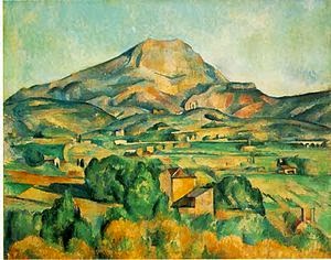
One of Cezanne's great loves was the Mont St Victoire and he spent many years trying to overcome the challenge he had set himself of representing this area. Whereas the Impressionists were trying to dissolve form Cezanne focussed on arrangements of constructed form and wanted to create this through flat planes of colour.
 
It's possible to see in this painting not only the turning road motif that Cezanne had studied before but also the flat planes of colour and the lack of a perceptible middle ground.


I think it's clear to see in these three pictures the increasing obscurity of the scene. It's almost as though everything merges or loses its definition in this last painting. 'Passage', a term used by art historians is the blending of overlapping planes into one another. This has the effect of integrating the figure with its background thus emphasising the 2D nature of the canvas.

Cezanne's further thoughts on the nature of Western perspective were that perspective depends on the viewer specifically having: one eye, one place and one point in time. These are not real conditions and he was absorbed by this for over 30 years.

In his still lifes, Cezanne considered that the movement of the viewer had to be taken into account. In order to avoid a horizon line he used patterned wallpaper as a backdrop and made the contours separate from the forms. Some critics argue that this slight distance has the effect of making the forms shiver slightly.
Cherries
 
Overall the challenges faced by these artists as they created paintings has had a lasting impact on the techniques of art. Various viewpoints, perspective, theories of colour and light to name a few have been incorporated and developed by the work of others with significant impact. 

Claude Lorrain and Turner

It's well documented that Turner bequeathed paintings to the nation on the condition that they were hung with Claude's work.

 
This painting, hanging in the National Gallery, was completed by Turner when he was in his 30's and was, apparently, much favoured by him as a rebuttal to some of his critics. Supposedly on seeing a Claude painting, Turner felt that it seemed to be 'beyond the power of imitation'.
 
Claude- Embarkation of Queen of Sheba 1648
 
                                           Turner- Dido building Carthage
 
But in 'Dido' Turner has created a painting matching Claude's work but emphasising his own interests. In 'Dido' Turner produces a direct view of the sun, light reflected on water and the transitory effect of light at a particular time of day-sunrise. Turner was Professor of perspective at the Academy so his detail of building is unsurprisingly skilful and these are typical of Claude's interests. However, Claude's critics have said that his works are almost rigid in the way they use a framing device much like a stage set and that he used diminishing bands of tone to create recession. Turner's later style comprises more complex pattern of shadows and highlights in keeping with its time and this gives more drama to the subject. 'Dido' displays attention to detail but has been achieved with more fluid strokes.
 
However, in some cases in works by the two artists the same division of the composition can be seen, as documented by Mr Freeman of the OCA photography department.
 

These are simplified versions of Claude's 'Rest on the Flight into Egypt' and Turner's 'Crossing the Brook' and these clearly show the dark side areas and the brightness through the middle sections leading the eye back and forth. Turner though was painting at a time of the Romantics and his work can show the almost objective style of Claude's as well as a more emotional response.
 
 
                                        Turner Peace: Burial at Sea 1842
 
Turner planned this composition as an octagonal piece. And he increasingly favoured square or octagonal formats as he concentrated on a central area especially of light. The colours in this work are in keeping with Goethe's book on colour theory that Turner studied carefully. As an ambitious and competitive person Turner's style constantly evolved. It was said that Turner wasn't trying to paint the effects of light but light itself and his canvases became more fluid and impressionistic.
 
                                                Norham Castle Sunrise 1845
 
Here all details are reduced to suggestions and colour is reduced to blue, yellows and red over a white ground which he used to heighten the tonality of the work. Turner painted this scene several times.
 
                                       Norham Castle on river Tweed 1822
 
This earlier version shows how the two works are composed similarly but very different in terms of colour. The side panels of darkness are much lighter in tone in the later work and detail is much reduced.
 
Turner's work has been discussed more in this brief essay than the work of Claude and this undoubtedly shows my preference for Turner's work. More than that though I think it reflects the development of Turner compared to Claude so decided to take a further look at the latter's work and his development.
 
The first thing I read was that Claude's work did evolve; but went from a more subjective, naturalistic style as influenced by Northern Renaissance to a more classical style with ruins etc.

 
 These two drawings by Claude were done c1635, and I like the looser more vital strokes worked here. To me they are far removed from his magnificent landscape paintings although it's probably true to say they shouldn't be compared.


Log p83 Perspective

One point perspective


For this drawing I chose the view from my living room into my kitchen.
I placed a piece of black tape on  the doorframe as a guide to my eye level and then decided that the central point was at the edge of the wall cupboard.
Starting with the door frame seemed logical as it has a strong vertical and from this I estimated the door and its panels before moving into the kitchen.
In the kitchen I worked first on the horizontal line of the nearest kitchen end panel, then estimated the angle of the worktop with a pencil. The wall cupboard was flat on so did not need perspective to VP.
Finally, I worked on the floor which is oak planks. I counted the number of planks in the doorway and then drew them in. Looking at the floor it's fairly east to see that they don't meet at the VP. I don't have a rug but put one in as just a rectangular shape going to the VP.

Than I put the ruler on it. Wow! My immediate reaction was just how sharp the line at the bottom of the door had to be and I was made well aware of how I had underestimated the acuteness of it. Same applied for the ceiling slope and the bottom door panels.

I can see that using a ruler really helps in getting the right angles for the perspective but can see, too, that a ruled line takes us into the realm of more 'clinical' types of work such as necessary in architects' offices. I read that some artists put pins in their work to show where the VP is and I can see that I need some practice in getting this right. And some others, or so I read, might put string across the room. I mentioned this to an acquaintance who is an artist and he replied, 'Well yes, I've got a vanishing point somewhere and I think it's in the room next door'. I could see the funny side of this and his advice was to think of angles as a transparent clock face and see what time it is compared to 3 or 9 o'clock. I've found this useful and was quite pleased when in my first life drawing class this week the teacher told me my angles were very accurate.

However, and going back to the exercise, and in mitigation, I will say that I found it really difficult to hold the drawing board in front of me whilst trying to draw the lines. Hopefully, an easel where the paper is held securely for me will help in achieving better results.

As I continued with the unit I found that I had queries regarding issues of perspective in other ways. Whilst on holiday I was looking at a row of arches and wondered how to construct these so that the distance between them was accurate. I found a very good website, as I didn't have any books with me, and found that rules of perspective cover so many different areas. I'm more of a language person than a maths person but found these drawings fascinating. I'm sure that experienced artists can do without working things out like this but also feel certain that learned theory helps sight sizing.

So, ruled lines can very much help in getting the perspective right as I found out when doing the above study.  The other aspect I found perplexing at first was the squashed look of some drawings and then realised that if the VPs are too close together the drawing will be distorted.  Lots to learn here but I believe progress made and have become very interested in perspective. While at the National Portrait Gallery earlier this year some paintings that really appealed to me were done from strange view points and the foreshortened effect was quite startling.

Copying this highly detailed drawing was daunting but an enjoyable exercise and it emphasised how some artists make everything go to one VP as a focus of attention. The OCA article on VP with the work of Harold Gilman 'The Kitchen' is a good example of this and I believe that the 'Last Supper' by da Vinci shows all the points lead to a VP, which is the figure of Christ thus signifying his importance.

Limited palette study

For this limited palette drawing I used the two colours of black and red plus the white of the paper. The sense of depth is helped by the linear perspective of the buildings as they recede together with the narrowing of the pavement. The colour/aerial perspective was helped by using stronger colour on the nearest roof which fades out as it gets further away.
 
This view is of buildings in Kelvedon which I chose because I liked the shapes of the roofs. I went on Sunday as I still find it difficult to work when lots of people are around but I know this difficulty will diminish as I become more confident. However being a Sunday might make the atmosphere a little quiet but not as quiet as this seems in the sketch.  I found the preliminary sketch sufficiently useful. Also I took several photographs for home reference. However I believe the colour is fairly accurate as these are old hand made tiles and the houses have black wooden beams so fairly straightforward to depict. If I was doing this again I would like to capture more in the way of street furniture such as lampposts and signs as well as people.

Log p93 Trees


This large flowering cherry is situated in my garden at home. It is very old and quite magnificent but also has a delicate foliage and graceful habit. I set up the easel in the garden after making several sketches and tired to capture its elegance. Also this tree has a really large trunk and the typical cherry features of shiny bands round about the trunk although being so old these are more gnarled than they once were. I tried to bring the tree forward by heavy shading behind one side and tried to indicate its depth and roundness by adding darker tone to the right hand side. Definitely missing though I think is any sense of scale-the trunk does show some of this but an object or person would help to give the tree its proper majesty. I also found it hard to be near enough to see detail but at the same time being far enough away to get size. This is where the preliminary sketches come in but still I found it difficult with such a large tree.

I sketched several trees including conifer and palm trees whilst on holiday. In each case I tried to see what was distinctive about the shape of the overall tree and the way the branches hung as well as the type of foliage. What I find most difficult is getting the simplified and overall tone on the tree. Squinting does help to isolate the larger shapes but these still need to be simplified to save lots of little tonal areas that are messy.

Reading Doreen Roberts book 'Drawing Workshop' I saw that she asked her tutor once how to draw trees. She said his reply was 'well, this week I'm doing it like this... last week I did it like this... and next week I might do it like this...' following each with a quick scribble. She says she realised he was saying find out for yourself and this advice she passes on to her readers. So lots more practice required.

In drawing this clump of trees I was looking for an area that would show a large foreground tree together with some smaller trees further back. This view also conveniently provided a small path going into the wood. I wanted to show that some trees were dark against their background and that some were light against their background as well as the fading colour of the trees further back. Most of the trees were very upright and I felt it needed some horizontals to alleviate this which I added at home. However, I felt quite nervous being in the wood alone with many strange noises and this didn't help concentration. Next time I'll take a friend along with me.