An English painter and printmaker Caulfield studied at the RCA from 1960 to 1963.
Sometimes included in what has been labelled as 'Pop Art', Patrick Caulfield's body of work shows his interest in using a technique of flat colour with no visible brush strokes. He is quoted as saying that blending tone, as taught at art college, was boring. Apparently he often made use of cheap household paint and kept his images to a bare outline. Angular negative or positive shapes predominate in much of his work and although it has been stated that he liked to convey a mystical atmosphere in his work, it's also possible to see a keen sense of humour at work such as the lobster sitting at the table in the example of Caulfield's work in the OCA Student folder
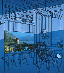
'After Lunch' includes the photorealism liked by Caulfield as well.

Pottery 1969
Caulfield was asked to produce work for a limited edition book and he chose to do a book featuring the poems of Laforgue; a poet who also influenced T.S Eliot. Here's one of Caulfield's pictures from the book-

Its title is 'Curtains drawn back from balconies of shores'
The use of flat colour and the angular shape is evident but Caulfield made the point that these images were not illustrations but complementary images, aiming to suggest what the poet saw when he wrote the words.
Consequently for the exercise in making a drawing in a similar style I have used a line from T.S. Eliot's 'The Love Song of J. Alfred Prufrock'. I like this poem immensely and chose the line
'I have measured out my life with coffee spoons'

'
Not feeling sufficiently confident in my ability to produce large ares of flat colour I decided to use card to cut out the shapes. As the poem describes the 'yellow fog' outside I used yellow for the window shape and for the fog outside and then cut 'swirling shapes' trying to suggest the fog coming into the room, thus trying to emulate the angular devices used by Caulfield. Finally the egg timer and spoon shapes were used as an obvious interpretation of the quote I chose to use. Looking at it I feel that the fog would have been better done in a bright colour to make more contrast between the positive and negative shapes.

Arita Flask
In fact in many of the white ware series the shape extends beyond the boundary of the paper as in this image above where the light from the window goes outside the paper at bottom left. So this is another technique I could have applied.
I like Caulfield's bold and often brightly coloured work as well as his more sober toned messages. There's a real sense to me of someone with their tongue firmly in their cheek; this approach taking 'the mickey' out of society and its conventions. I'm glad to have been asked to do this exercise that introduced me to Caulfield for the first time and I hope that I have shown this.
No comments:
Post a Comment